Visualisation
Textable
Textable is an Add-on to a really interesting visual tool call Orange3. With them together you can do textual or data analysis and shaping, and filtering, WITHOUT coding.
Taguette
If you need to tag, or codify some text, looking for themes in transcripts, this free web-based tool is great.
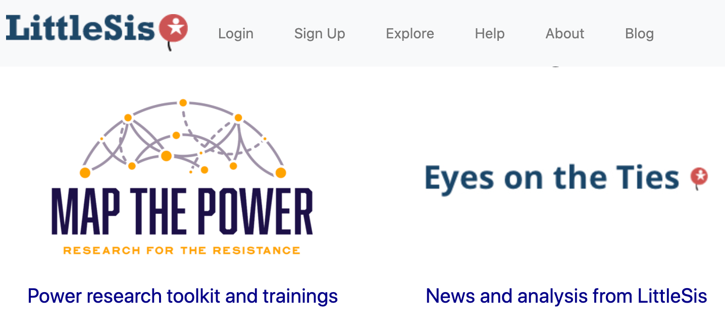
Little Sis
Brilliant site that is a mixture of a database of people and corporations and governments etc. and tools to "connect the dots" between them.
For example, take a look at How Fracking Special Interests Infiltrate the UK Parliament
See also: My Little Crony
Cables
Shaders are the code that runs complex computer graphics. Cables is a visual language to create shaders. Now has desktop apps too.
Infogram
Quickly adapt infograph templates to fit your data. Used to freemium and nice. Now you can't download. RUBBISH!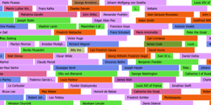
Information Is Beatiful
A totally fantastic collection of visualisations and infographics to explore and imagine making yourself.
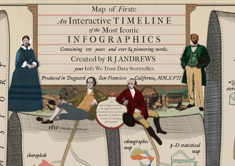
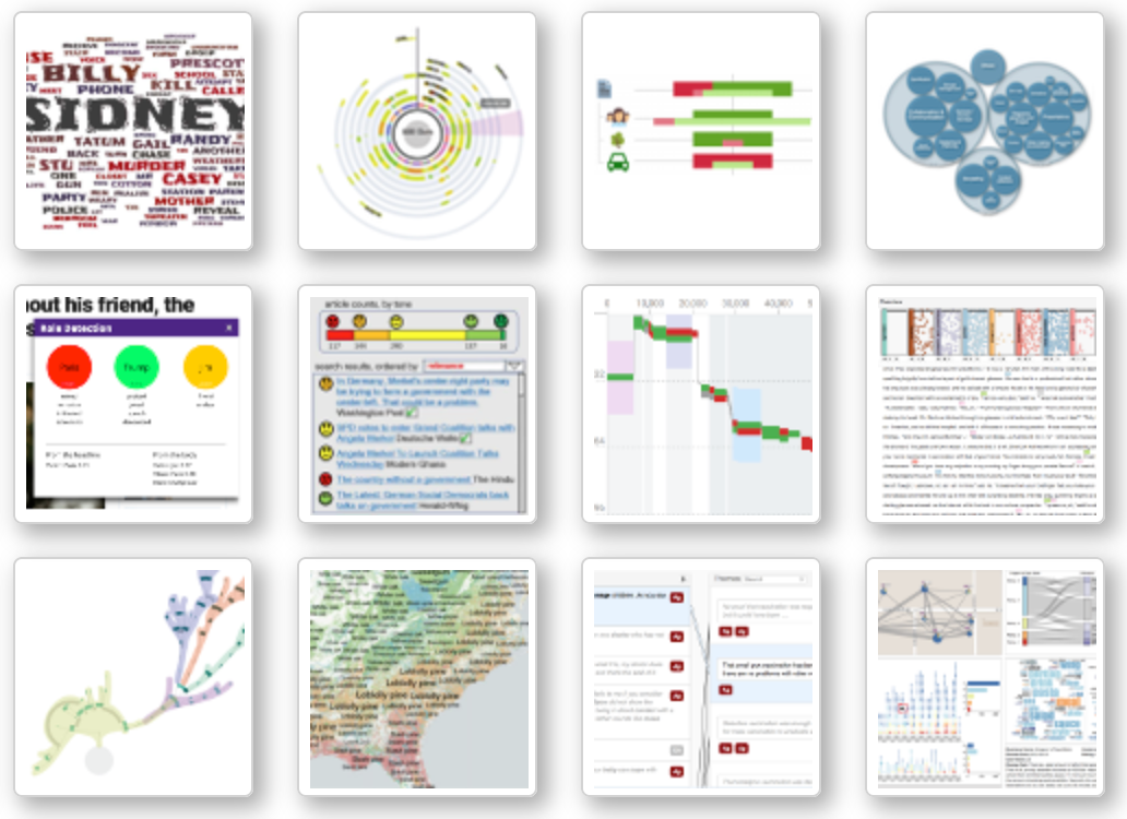
An Interactice Timeline of Infographics
Brilliant visual representation of the development of visualisation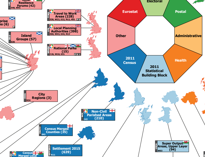
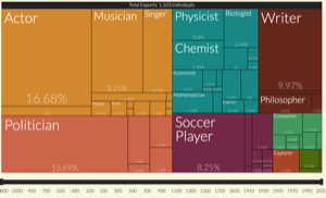
Hierarchical Representation of UK Statistical Geographies
How difficult is it to know data about the U.K? Check this out.
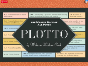
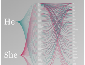
“Plotto”: Generating Truly Offensive Stories Since 1928
Incredible article covering storytelling, gender and visualisatuon
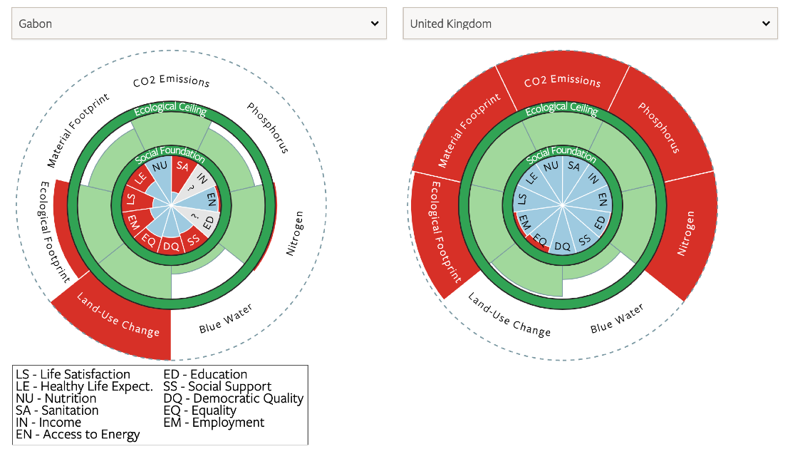
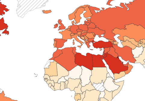
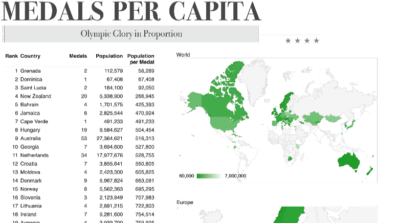
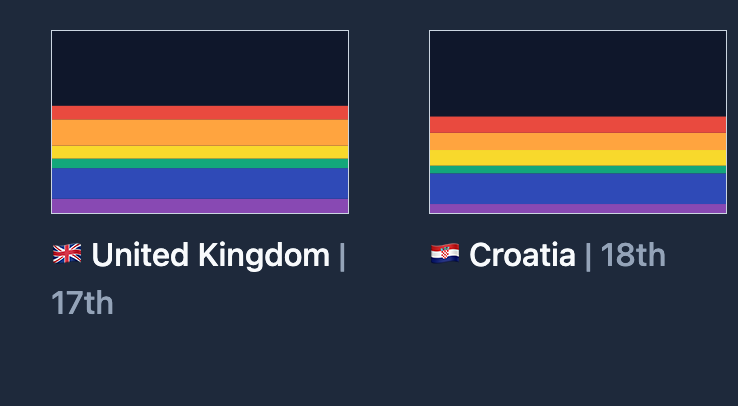
Country Comparisons
Select a country to view its performance relative to the Doughnut of social and planetary boundaries and see how it compares with other countries. Dark green circles show the social foundation and ecological ceiling. Blue wedges show social performance relative to a threshold associated with meeting basic needs.
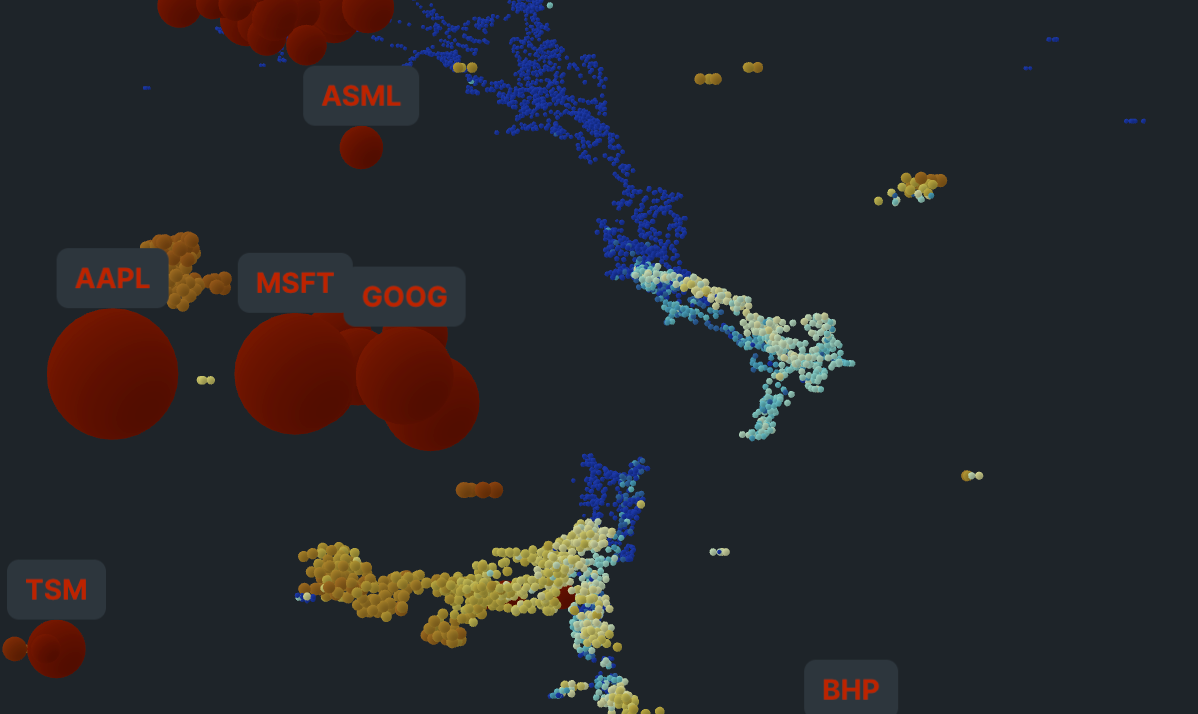
Calculating Empires
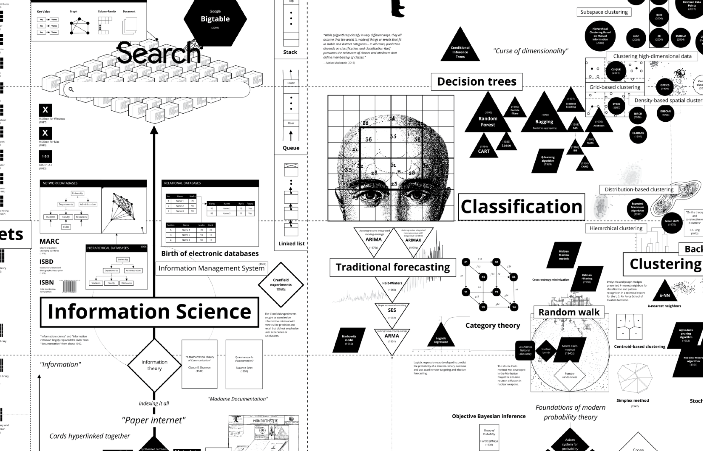
A quite amazing diagram, that is "A Genealogy of Technology and Power Since 1500"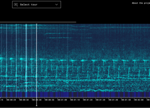
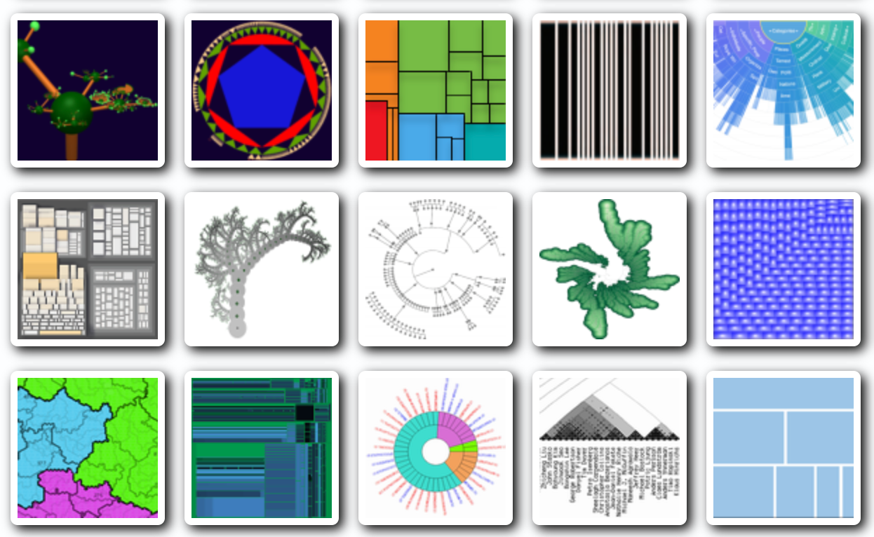
Data Visualisation Guide
Fabulous resources explaining a huge range of different visualisation types. Check out this excellent page on TIDY DATA..
Data Sonification Archive
This curated collection is part of a broader research endeavour in which data, sonification and design converge to explore the potential of sound in complementing other modes of representation and broadening the publics of data.
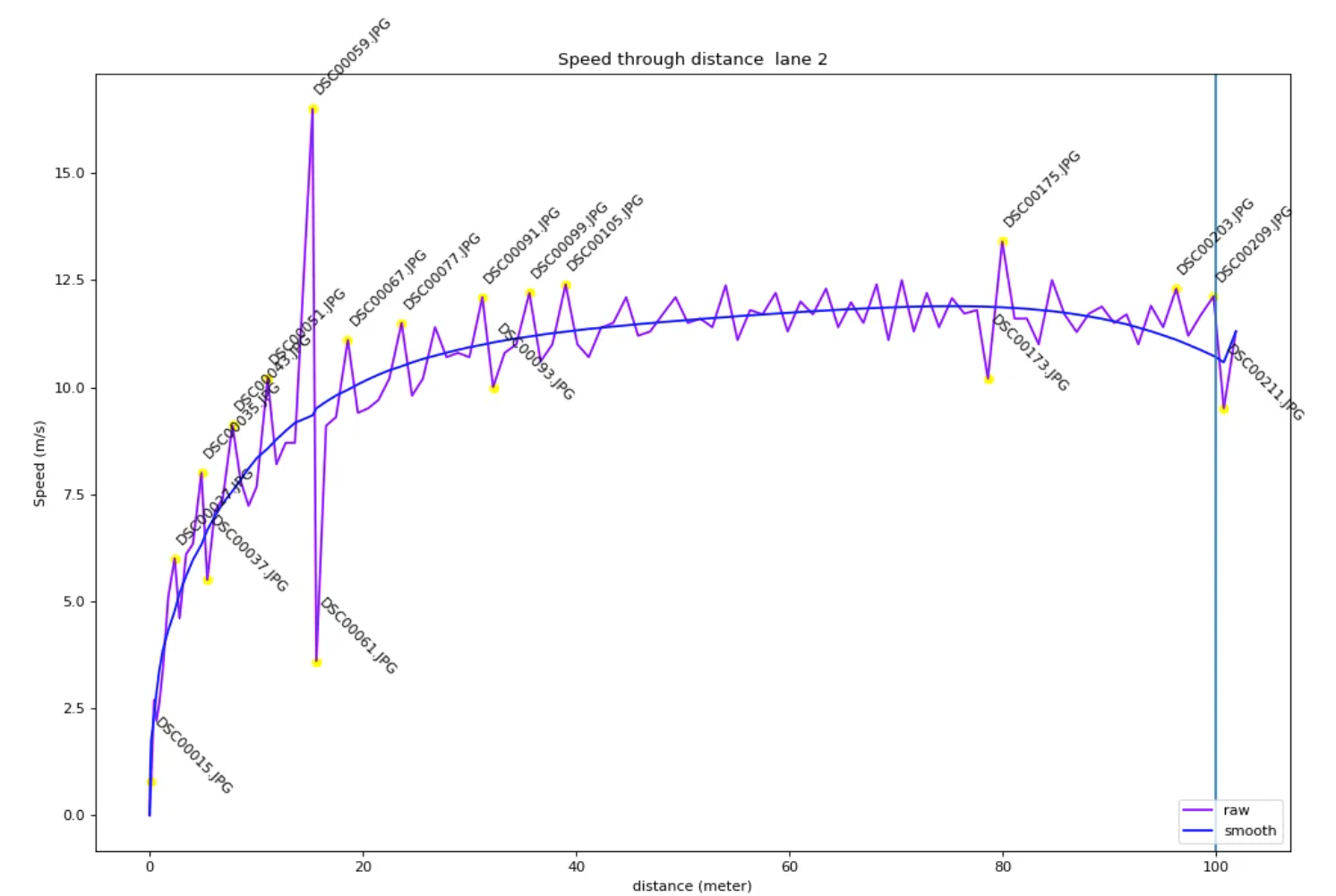
Discovering Speed Data From Photos
Interesting article on how photos are used to generate speed data from the Tokyo Olympics.
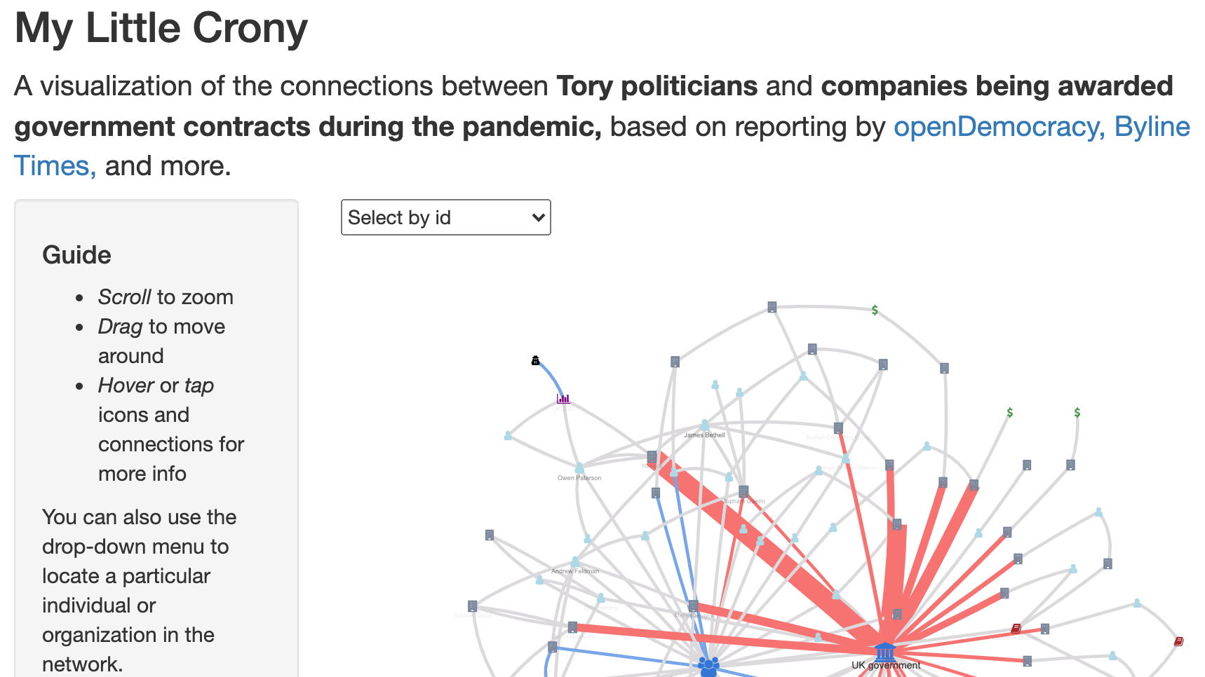
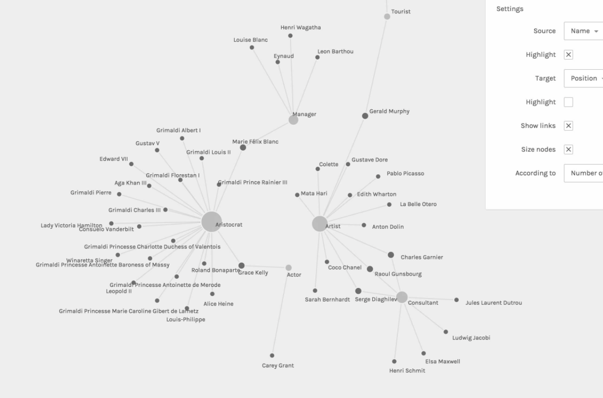
My Little Crony
Wonderful visualisation of connections, companies and corruption with UK politcians.
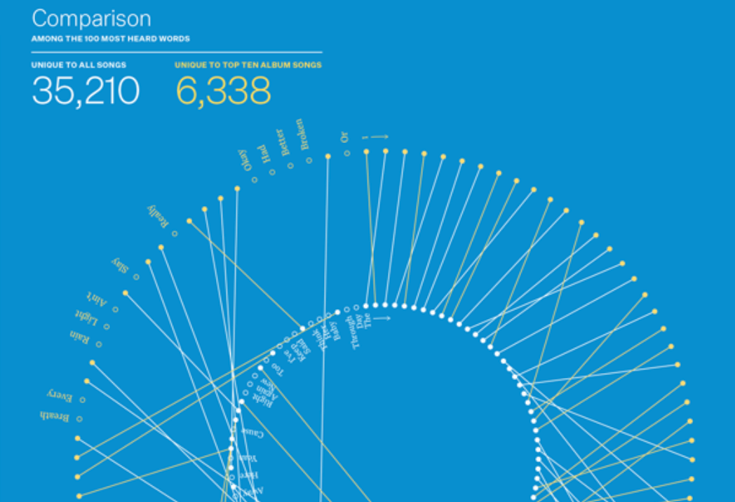
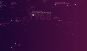
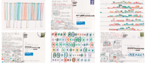
A Year In Lyrics
An interesting quantified self project in which Eric visualise the lyrics of all the songs he's listened to in numerous interesting ways
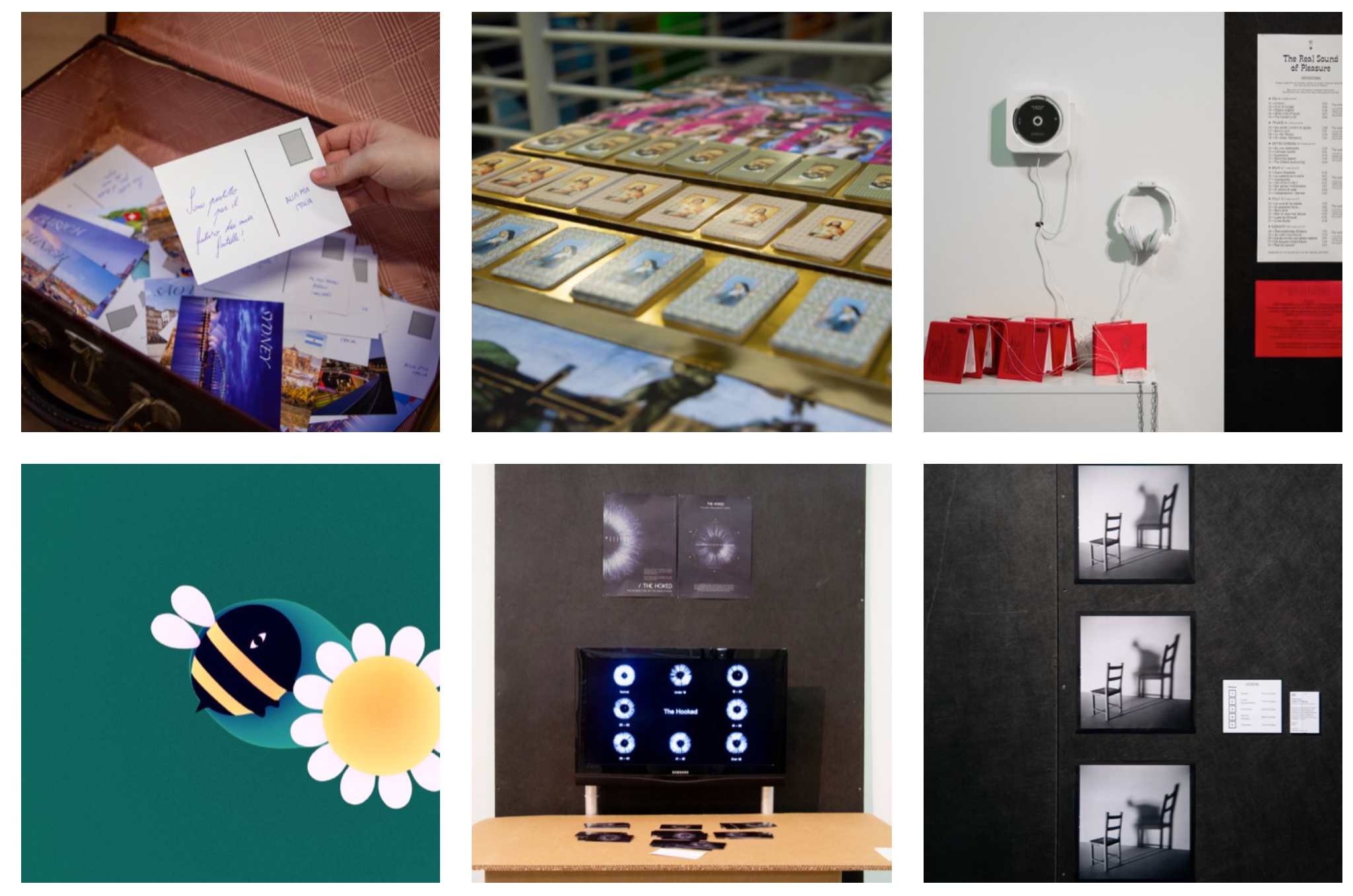
Dear Data
...whose creative practice ranges from book design, information design, data visualisation, and commissioned artworks using data.
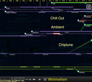
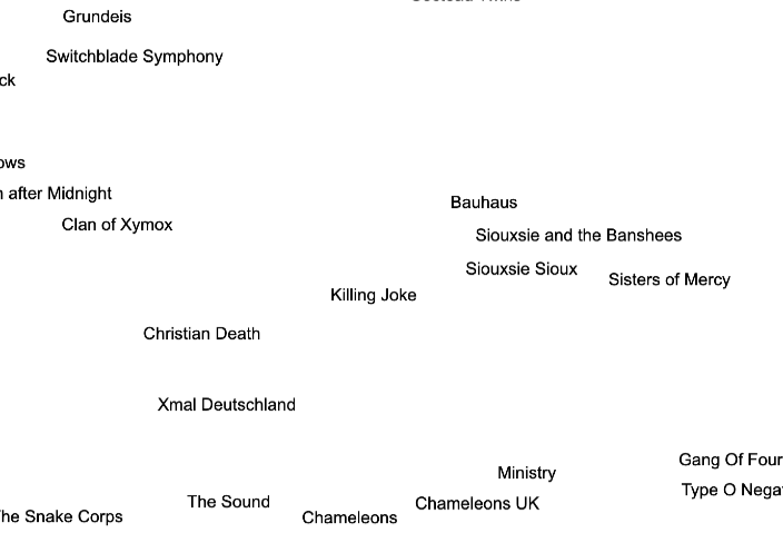
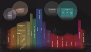
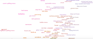
Ishkur’s Guide to Electronic Music
Large visualisation. Zoom in and listen to each genre, from Musique Concrete to Glitch Hop
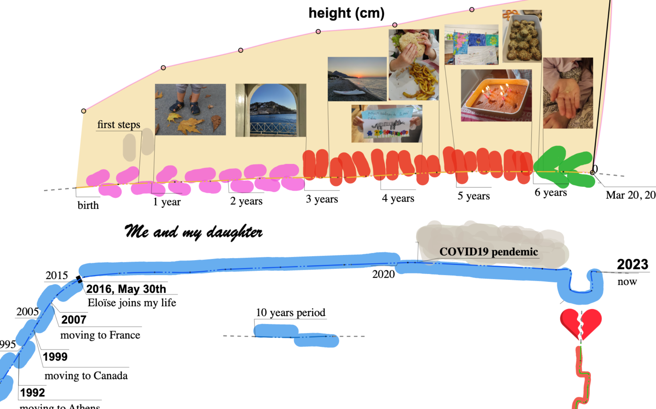
On Timeslines
How many ways are there to draw time? Think about what time aspects your data has, and go and see if you could could be displaying it better.
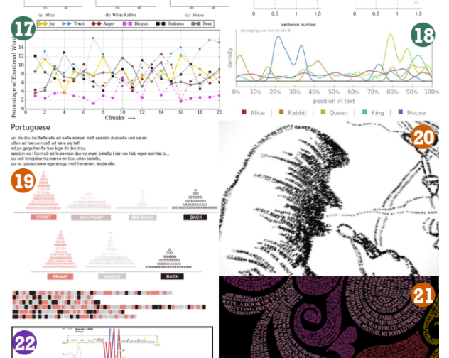
Alice In Wonderland Visualised
How many different ways has Alice In Wonderland been visualised - you've always wondered. The answer is 58. Amazing